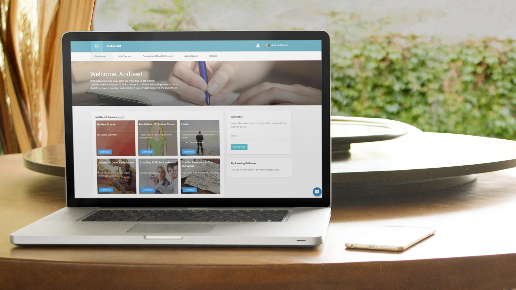
At Go1 we understand that having navigation tools that are easy to use and don't clutter up your screen make more an awesome user experience. We have already got a great menu system in place, but we have just made some changes that will make accessing different areas within the platform a lot quick and easier, as well as freeing up even more space on your screen!
To make this happen we will shortly be relocating the existing navigation menu that was previously located on the left hand side of the screen to appear at the top of the screen. This change allows users to be able to utilize a larger area of their screen while using the platform which is a major improvement, especially for our users on mobile devices or tablets.
The new navigation bar will appear whenever you are at the top of a screen, however as you start to scroll down the page, it will automatically collapse. If you would like to use the menu mid page, we've got you covered there too. All you need to do to make the navigation bar reappear is click on the button, next to the 'Dashboard' text, and your menu will reappear.
This update will not only free up more screen space, bit it will also allow for users to quickly jump between different areas of the platform such as their courses, the marketplace, and their dashboard. All page content is now set to display centered on the page in a clean and crisp format that is simple to navigate.
In order to make Go1 the best Learning Management System for our users, we are now releasing new product updates every 2 weeks containing improvements, new features, bug fixes and more. To keep up to date with these updates via our customer newsletter, please click here.


